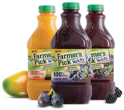
The new line was introduced in February 2014 in a 48-oz, rectangular PET bottle in three varieties: Concord Grape, Mango, and Blackberry. The beverages are made from unfiltered juice and are advertised as having “no artificial flavors, synthetic colors, or preservatives of any kind.”
“Farmer’s Pick by Welch’s is made with unfiltered juice to deliver fresh-picked fruit taste to the shelf-stable juice aisle,” says Welch’s CEO Brad Irwin. “We needed a bottle that communicated the innovation and key attributes of this product line in a contemporary, modern way.”
Delivering that bottle design was 4sight inc. in collaboration with Welch’s and plastic packaging supplier Graham Packaging Co. LP. In creating the structure for the new product, 4sight relates that it was challenged to deliver consumer-inspired bottles that would also enhance Welch’s supply chain capabilities. To uncover meaningful imagery attributes for the design, 4sight worked with consumers—including in-home research to observe contextual interactions, and consumer brainstorming with designers—and then transferred those attributes into concepts. It was Graham’s job to further develop the shapes and concepts into a functional design.
“We applied a new visual language to communicate the vibrancy, the distinctive flavor, and the ‘straight from the farm’ equities that truly represent the Welch’s brand,” explains 4sight President Stuart Leslie.
The rectangular footprint of the bottle is reminiscent of a carafe shape, while beveled corners add a crystalline, premium touch. The upper neck narrows for better gripping by the consumer. A spiral detail along the neck swirls elegantly from the label to the cap, providing added energy and visual interest. “This detail subtly suggests a reference to the vines from Welch’s most essential ingredient, Concord grapes, but could also be interpreted as a swirling wave of fun and flavor, making it equally appropriate for any flavor of juice,” notes Jason Billig, Design Director at 4sight.